- Published on
Refilter: Swypex React Filter Library
Refilter: Powering Flexible Data Filtering
We’re excited to introduce Swypex’s internal React Filter System—Refilter!
When building a financial application that caters to diverse use cases across our customer base, we faced a key challenge: enabling users to efficiently navigate vast amounts of data. While we could anticipate some useful ways to display this data, our goal was to empower users with maximum customisability. This meant creating a system that allows filtering data across multiple dimensions. Adding to the complexity, each feature in our application involves a unique set of fields to interact with, requiring a solution that works seamlessly across all pages. With no perfect match in the open-source community, Refilter was born.
Refilter allows us to seamlessly implement filtering capabilities on any page in our application. By eliminating boilerplate code, we’ve streamlined the process for our engineers. Now, when developing a feature or page, all we need to focus on is fetching data from the backend API. Once individual filters are connected, the system automatically generates a pre-designed filter dropdown that plugs directly into the page.
This package offers an ideal solution for implementing advanced, strongly-typed filtering systems. By managing filter states and interactions, we can focus on the data interaction logic.
We hope Refilter eases the challenge of managing large datasets in your applications and helps you build more efficient, user-friendly solutions. Below, you’ll find further details about the package, a demo, and guidance on how to use it effectively.
We also invite the ReactJS community to contribute, provide feedback, and open PRs to help improve Refilter. Visit our GitHub repository for detailed documentation and to join us in making Refilter an even more robust and versatile package.
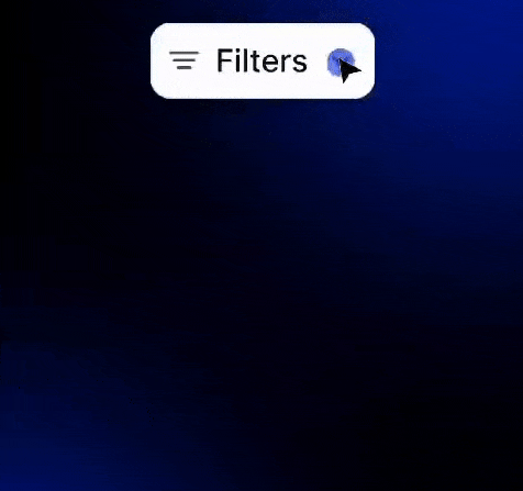
Demo
We also have created a real application demo. You can find the implementation details in the github repo as well as deployment at https://refilter.swypex.com.
Here is a short demo taken from Swypex application.
Features
- Simplified State Management: Reduce the complexity of managing filter states, allowing you to focus on crafting specific UI and business logic.
- Dynamic Badge System: Automatically generate filter badges for quick access, enabling users to easily remove or adjust filters.
- Customisable UI: Fully define how badges, side panel items, and content are rendered for each filter to fit your application’s design.
- Overridable Styles: Modify class names or use the provided HOC to apply custom styling for a tailored component experience.
- Type-Safe Development: Built with TypeScript for a robust and reliable development process, ensuring strong typing across your application.
Installation
It’s a super easy 2 step installation 😀
- Install with NPM or Yarn
npm i @swypex/refilter
- Import this style sheet in your CSS
@import '~@swypex/refilter/output/main.css';
How to
We’ve made it easy for everyone to get started by including default styles inspired by the Swypex design system. If you’re using TailwindCSS, importing this package ensures your filters will look as sleek and beautiful as Swypex is!
import {
	GenericFilter
} from '@swypex/refilter';

const App = () => {
  return (
    <GenericFilter {...the_required_filter_props}/>
  );
};
We understand that your design needs may differ, so we’ve made it easy to customise the filter’s style to fit your brand. See the example below
import {
 createStyledGenericFilter
} from '@swypex/refilter';

export const StyledGenericFilter = createStyledGenericFilter({
  closeButton: 'bg-red-100',
  ...
});

import {
	StyledGenericFilter as GenericFilter
} from '@/components/GenericFilterWrapper';

const MyComponent = () => {
  return <GenericFilter />;
};
If you need to customise the filter’s style, it’s simple to implement. Just import your generic filter and apply your desired styles using tailwind syntax
import {
	GenericFilter
} from '@swypex/refilter';

const MyComponent = () => {
  return (
    <GenericFilter
      classNames={{
        closeButton: 'bg-red-100',
        ...
      }}
    />
  );
};